
Question 2: How
effective is the combination of your main product and ancillary texts?
Creating my poster
For the
creation of my horror poster I had to make sure that it followed the
conventions of a typical horror poster. Basic research went into it and I found
some key aspects that I need to include. I first took inspiration from the
“Nightmare on Elm Street” trailer which I based my own poster around. I
selected this poster because it was a villain dominated poster and I feel that
there are not many of them in the industry. Also I feel that the USP (unique
selling point) for my trailer is the killer. So I wanted them "front and centre"
in my marketing. Also I took ideas from the “Blair Witch Project” poster. I liked the
way the poster gave the film clear location, something that I wanted to
create with my poster. That is why the killer is surrounded by the environment
around them so you know exactly where the film will take place.


Colour was
the first important feature, as certain colours give connotations of wider
themes. The main colour of my poster is red. Red connotes danger, warning
people of the terror that the movie has. The same way as any signifier works,
it set up early indication to hazards ahead, and that’s the kind of vibe I
wanted to give off with my poster. Red is also the colour of blood, this warns
of the “body horror” that people will see in the film. This was important to
get across, because my film is an action horror, merging both gore and
excitement.
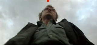
Expressionist
angles were another important factor I had to include in my poster. I wanted to
show the killer from the film, and put him in a position of power staring down
over the audience. This shows the audience that this character will be strong
and almost indestructible, the typical convention of a psycho serial killer
which can be seen in the shot of Rutger Hauer in “The Hitcher” after he is
thrown from the car.
The lighting on the poster shows off the killer with back lighting. This creates a silhouette that hides the majority of him, so there is still that shock moment when he is first revealed on screen. His dramatic pose reflects the genre of ‘action’ horror, having all the big moments shot.

The lighting on the poster shows off the killer with back lighting. This creates a silhouette that hides the majority of him, so there is still that shock moment when he is first revealed on screen. His dramatic pose reflects the genre of ‘action’ horror, having all the big moments shot.


My poster was based around one from the remake of Nightmare on Elm Street. It’s very similar in the respect that the killer dominates the poster. I choose this because it breaks conventions of showing off the killer before the film. Many posters tease at the themes and horrors they include, but I prefer being more obvious. I wanted the audience to see as much of the narrative as possible unfolding right in front of their eyes, which links into the detail of the horror trailer.

Creating my magazine cover
Making my
magazine was a different matter. Rather than make an all out statement with it,
I decided to do a more subtle feature on the director of the film. I felt this
would attract a different kind of audience from the poster and widen the appeal
of “Harvest on Crepsley Hill.”
A pull quote
(a small section of the interview which would attract people in to buying the
magazine to discover what the quote is all about) was important as nearly every
magazine has one. This acts as a way to attract people in to the magazine when
they see it on the shelf’s in the shop. It gives the audience an idea of what
the main article will be about.
The lighting
was something I needed to get right, because while it not is an outright horror
image I still need to give of connotation that it is. That’s why after I
finished work on the cover I added a smoke texture and also a
contrast/brightness filter. This filter allowed this cover to give off that low
key effect which horror movies have. Plus it juxtaposes well with the blue
colour scheme of the rest of the titles, making things easier to see and read.


The
mise-en-scene of the picture gives connotations of a director that is a hard
worker. The basic picture against a plain brick wall gives the impression that
this director is always hard at work at set and is an almost working class
grafter. Also his ordinary clothes give this sense of a director who main aim
is to get to set and start work on his project. A major chunk of horror’s
audience is working class, so I felt this would help the cover appeal to them.
I decided to
go for “Total Film” magazine because I want to try and hit both sides of the
target audience we had planned for. While it is your classic mainstream horror
film, with the typical conventions, I feel that focusing on the “auteur”
director it would pull in some new people to horror movies. Horrors are
sometimes attacked for being cheap pieces of cinema just out to make a quick
buck. However with this I wanted to show that there was new hope for the genre,
with a respectable “auteur” effort behind its creation
My cover was very similar to the “Total Film” cover I saw which focuses on “Sherlock Holmes” in which there is one main image and a pull quote. This format was interesting because of it simplistic nature. A lot of magazines try too hard to catch your eye they end up being a mess. This format allowed me to show my film as the main focus of the issue, and the primary film people should be thinking about.


How does your poster and magazine
cover tie into the style and look of your trailer?
My trailer
is aimed for an audience from 16-40, with the main demographic of males. With
this type of audience I approached my ancillary products in a way that would
please them all. For my poster I used a lot of red and the villain for the
connotation of violence and action in my trailer. I wanted to show them I wasn't hiding about the true 15 certificate nature of “Harvest on Crepsley Hill”.
I wanted everybody to know that there would be a high body count, and the next
iconic slasher movie. This poster acted as a statement to the competition, as
much as a tease for the film and my target audience. This horror wasn't going
to hold back.

The magazine however appealed to the more educated side of my target audience. Horror fans are often dedicated to certain auteurs, such as; George A. Romero, Alfred Hitchcock and John Carpenter, they can care as much as what happens behind the lens than they do in front of it. So what better way than have an exclusive with the director, giving them an inside into the film and the ideas behind it? This is why I went for “Total Film”, as I feel that it is the one magazine that allows me to hit both mainstream and niche audiences. “Empire” would be too mainstream, and “Sight and Sound” would be too arty, but “Total Film” hits just the right note.
The magazine however appealed to the more educated side of my target audience. Horror fans are often dedicated to certain auteurs, such as; George A. Romero, Alfred Hitchcock and John Carpenter, they can care as much as what happens behind the lens than they do in front of it. So what better way than have an exclusive with the director, giving them an inside into the film and the ideas behind it? This is why I went for “Total Film”, as I feel that it is the one magazine that allows me to hit both mainstream and niche audiences. “Empire” would be too mainstream, and “Sight and Sound” would be too arty, but “Total Film” hits just the right note.
No comments:
Post a Comment