
Thursday, 28 March 2013
Tuesday, 26 March 2013
Media Evaluation - Part 4
Question 4: What have you
learnt from your audience feedback?
Praise and criticism was highlighted in your focus group
screening
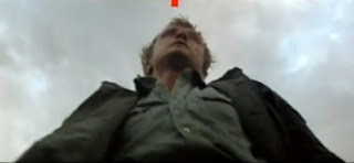
One of the big praises we received was the jump scare at the
end through collision cutting. In the feedback a lot of people spoke about it
saying that, for instances “The end was
really effective”. I agree with this as I feel it works well to make the
trailer memorable for the audience. The final scare sticks in the mind of the
viewer, because the scares stay inside the head of our audience after the
trailer has finished. This would hopefully lead to a positive word of mouth
about the trailer, a vital form of advertising that can lead to "viral marketing" that can elevate a low budget film (such as "Paranormal Activity") to mainstream success.
One of the big criticisms was the music. I can see why
people spoke about it, saying things like the- “Soundtrack wasn’t horror enough”. I agree with this as the music
doesn’t make you feel the emotion of horror. It is not suspenseful or match the
action on screen. However, I do think the rocky feel
of the soundtrack ties into action horrors like “Resident Evil 4” and “Doom” and is not against the conventions of this sub-genre of horror.
Another criticism we received was the trailer was “Very action oriented”. I can’t agree with this being a problem with the trailer because of the sub-genre of “Harvest on Crepsley Hill” was specifically an ‘Action horror’. If we didn’t show all the conventions of the action genre, then people would be annoyed by our final product. The Day of the Dead trailer is a good example. It annoyed people because the trailer was nothing like the actual film, and we knew how much, our target audience would be annoyed if we didn’t establish exactly what the film would be like. I was happy the trailer had enough action and horror aspects to achieve our aims.
Another piece of widescale praise was
the “Great gore effects”. I do agree with this because we worked a lot
of these effects during and after shooting to get these effects in. We all feel
that they work well with the conventions of action horrors. The moment Richard
spits blood onto the camera with the help of the ‘After Effects’ program is just a great
moment in the trailer and, it was satisfying to hear the audience react to it so
positively.
The last minute changes we made
because of the focus group screening
One of the biggest complaints from the focus group was the
volume of the music, and the dialogue of the actors. So after the group
screening we adjusted the volume contro, and deleted almost all of the dialogue.
The trailer didn’t feel professional until this problem was addressed.
We also
added a few shots to the trailer, just to explain the narrative better. The
best example of this is when I (Aaron) am running away from Ryan. It cuts from
a shot of me running to me on the ground. So we went back and added a shot of
me being knocked out. This helped to explain my character’s fearful emotions in
more detail, while also allowing us to add another convention of the horror
film with the use of collision cutting. There is now a slow shot of my reaction,
before I am suddenly and shockingly killed by the machete.

The text also needed improvement. We changed the basic inter-titles look to make it look more professional. Other computer effects helped too. We added a filter to the footage, the simple change of lighting changes the whole feel of the trailer to a night-time diegesis. Again this change allowed us to add another convention of low key lighting, giving an atmosphere of mystery within our trailer.

Are you happy with your final product?
Now I have
finished the trailer I can say I look back on it with great pride. I feel that
it went really well in creating a product that wouldn’t look out of depth on a
cinema screen. I feel that the group worked to each other’s strengths; With
myself and Richard primarily on acting and filming, and Ryan and Frazer on editing and
After Effects. It was a great team effort.

Obviously
there are certain things that I think went really well in getting across the horror
conventions to their fullest potential. For example the music that Ryan
developed worked really well within in the trailer. It twists on conventions to
have almost contrapuntal music, but getting across the sub-genre of action horror. The music is metal,
which is rare in horror films, but it also shows the action on screen of people
getting killed to music you listen to. We felt that the traditional suspenseful
music would feel out of place in our modern feeling trailer.

Some of
shots within the trailer work really well in delivering the body horror. The
close up of Richard delivers body horror and works well in showing the emotion
of the character in the scene and builds emotional connection, something that
all good horrors need to do.

Looking back at the target audience we set out before we started I feel that we would appeal to them. We also had ideas of having a female heroine in our film (who is the only one who survives unscathed in the trailer). This shows how we stick to the forward thinking style of the modern horror genre. We feel that this film fits our target audiences perfectly, and would have matched the success of films such as “Resident Evil 4” and “Dawn of the Dead” (2004).

Looking back at the target audience we set out before we started I feel that we would appeal to them. We also had ideas of having a female heroine in our film (who is the only one who survives unscathed in the trailer). This shows how we stick to the forward thinking style of the modern horror genre. We feel that this film fits our target audiences perfectly, and would have matched the success of films such as “Resident Evil 4” and “Dawn of the Dead” (2004).
Media Evaluation - Part 3
Question 3: How did you use
media technologies in the construction, research, planning and evaluation
stages?
Using media technologies in my research and planning stages
Media technologies helped a lot in my
research and planning as they allowed me to access the areas I needed to gain
further knowledge. Also it allowed me to experience things first hand, rather
than be told in class.
YouTube helped me to gain a basic knowledge
of trailers as it allowed me to watch many, all my different time eras. -This
helped me discover what works in a trailer, and what I should stay away from.
The downside is YouTube can provide as a distraction when working. You can end
up going off on a tangent and losing variable lesson time with too much viewing
time. After looking at so many trailers I found 3 that help me planning the
most.
After looking at so many trailers I found 3 that help me
planning the most.
The first of these key pieces of research was “Day of the Dead”, and this helped me for all
the wrong reasons. It showed me how not
to make a horror trailer. The trailer comes across as a cheesy comedy and
nothing to take seriously. However, after viewing the film I can say it’s
nothing like that, with it being a heavy body horror. This is one scene in the
film where we see a man get ripped in half, and is eaten by the zombies.
Something that audience wouldn’t have expected from the trailer. This showed me
how I needed to make all the conventions of my action horror to come through in
the trailer, I needed to make people got the right atmosphere from my trailer.
Or people would come see the film and be annoyed because it’s nothing like the
trailer.
“Land of the Dead” was the genre as my trailer, with it
being an ‘action horror’. This provided a good template for my trailer and gave
me an idea of how to get across the themes in my trailer. It worked in building
a small narrative but showing of a lot of the action. There is no doubt what
type of film this is going to be, it has a clear target audience and it knows
who it wanted to attract. This direct style was something I wanted to get into
my trailer.
Finally the re-make trailer for “Evil Dead” showed off how
to make a trailer which just works for everybody. Watching this is class
everybody was in awe of it. This was the trailer that everybody wanted to make.
The perfect balance, between ‘action’ and the narrative, and the increasing pace made for an unsettling by impressive viewing. This was the trailer
that I wanted to really shape around and have something similar to with my
finished product.

DVDs were
also extremely useful during the research and planning stages. It allowed me to
grow more of an understanding on the horror conventions, and also discover what
I prefer as a type of horror: action horror, body horror or psychological
horror. The many different DVD’s allowed me to see content that isn’t online,
due to copyright. However the only problem is that you have to buy these DVD’s
and there isn’t every chance the content you want will be on there. The effort
and money was worth it with the Eli Roth interview on the Cabin Fever
DVD, which allowed us to see how the modern director plans to scare a modern
audience.


Using media technologies in my construction phrase
Photoshop
was a major tool in the construction phrase of my coursework. It allowed me to
create the ancillary texts from scratch, and my improving understanding it helped
me bring them to professional standards.

The simple
addition of a lighting effect (using the Filter/Render menu) allowed the killer to stand out from the rest of
the poster. The direct lighting on the centre of the image gives the poster
much more of a professional look, and makes the text around the edges stand out
more.
Layers were
also very important on Adobe Photoshop. The ability to place layers on top of
each other using the simple layers menu on the bottom right of the screen meant
I could add smaller logos and text, helping creating a realistic looking poster
and magazine cover.. Bevel and emboss features for texts (using the FX menu
underneath the layers) allowed for texts to stand out from the picture.
Headlines and quotes can be brought out to be more of a focus with the simple
tick of a box. These simple features help you pick up Photoshop with ease, and
to give the feature a much more realistic edge.
DaFont was
also a useful in creation because the college computer did not have a wide of fonts.
Instead, we this huge database in which I could find a style of text that
would fit the bill perfectly. We used "Bebas Neue" in our trailer to give it a
broad standing font that wasn't as cliche as Impact, and to make sure letters stood out and could be read clearly.
On the poster I used the "Evil Dead" font, for a much creepier atmosphere on the
poster, without the text the poster wouldn’t stand out in the way it does
now. Finally, for my magazine I used
"Arial Black". This text was bold and defining, every letter stood out and made
the magazine headline clear to read and to understand. Without this text I
wouldn’t have had the bold headlines which help all the detail of my magazine
stand out.

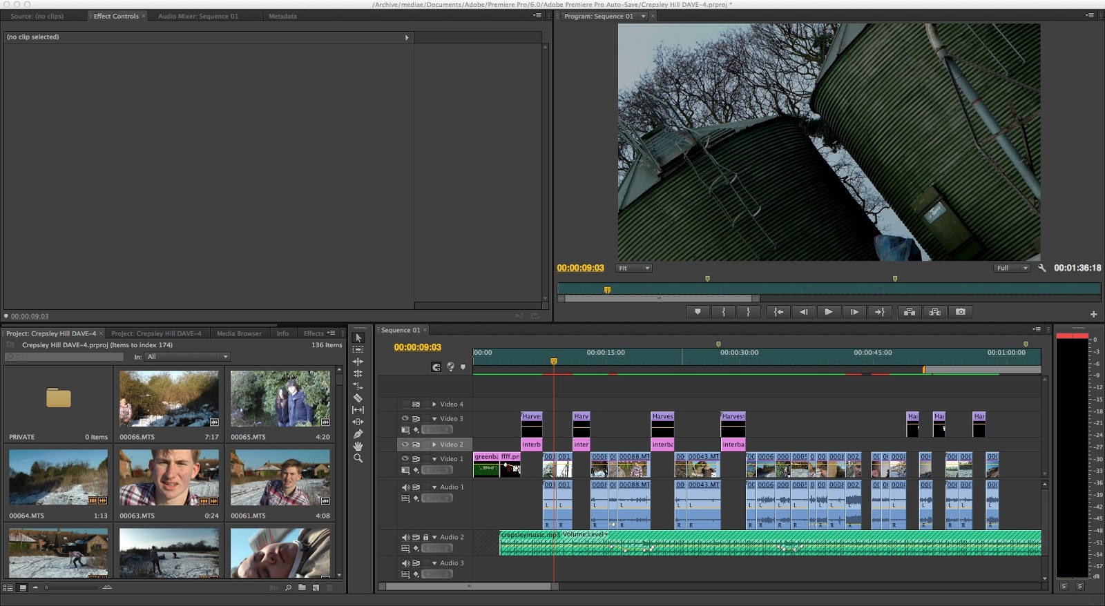
Adobe
Premiere Pro was a new programme which I had never used before this year but it
helped hugely with the creation of our horror trailer. This allowed us to have
a professional feel about our trailer. It allowed us to add filters to our work
(contrast and brightness was particularly useful to make the trailer seem more
at night) and it helped “Harvest on Crepsley Hill” look less like it was shot
on a HD camera. By simply increasing the contrast it looked more like a film
than a video, Adding music and sound effects of SoundBible with ease also
helped. Our intertitles were also to the industry standards. These shots didn’t
look like a PowerPoint slides, but more of a blockbuster feel. Using thr
“emerge text” tool on Adobe After Effects to add an effect of Richard spitting
blood on the camera, using the blood on one layer in front of Richard, just
like working on Photoshop.


Lastly, the
still and HD camera allowed us to capture with ease. They were so easy to get
use to that we were all using them to the best of their ability, they were
always close by so nothing ever went amiss.
Using media technologies in my evaluation stage.
A Focus
group for the rough cut of our trailers was recorded on an HD camera and let us
see the true reaction of the audience to our trailer. This recording allowed us
to see what moments of the trailer worked and the audience enjoyed. But also
allowed us to see what they didn’t like-, and we could re-watch this focus
group on YouTube to help remind us where we needed to improve.
Issuu allowed me to present this evaluation in a much more professional manner. Through this program I feel that the overall look of my final piece of work on this subjects look up to professional standard. This format allows for ease of navigation. You can easily find questions and response to areas on the course, and I chose to enhance this with embedded YouTube videos of my own work and various trailers that inspired me.
Finally, sharing the rough and final cuts of "Harvest on Crepsley Hill" on Facebook allowed me to broaden out to see opinions on the trailer
outside of my media group. This simple sharing process helped me a lot to see
how more of my target audience felt about my trailer. This twinned with a
survey showed me a physical response from my target audience on my trailer.
These methods helped me a lot in the overall improvement from the rough cut to
the final screening, which can also be seen on YouTube as it was filmed on an
HD camera.

Media Evaluation - Part 2
Question 2: How
effective is the combination of your main product and ancillary texts?
Creating my poster
For the
creation of my horror poster I had to make sure that it followed the
conventions of a typical horror poster. Basic research went into it and I found
some key aspects that I need to include. I first took inspiration from the
“Nightmare on Elm Street” trailer which I based my own poster around. I
selected this poster because it was a villain dominated poster and I feel that
there are not many of them in the industry. Also I feel that the USP (unique
selling point) for my trailer is the killer. So I wanted them "front and centre"
in my marketing. Also I took ideas from the “Blair Witch Project” poster. I liked the
way the poster gave the film clear location, something that I wanted to
create with my poster. That is why the killer is surrounded by the environment
around them so you know exactly where the film will take place.


Colour was
the first important feature, as certain colours give connotations of wider
themes. The main colour of my poster is red. Red connotes danger, warning
people of the terror that the movie has. The same way as any signifier works,
it set up early indication to hazards ahead, and that’s the kind of vibe I
wanted to give off with my poster. Red is also the colour of blood, this warns
of the “body horror” that people will see in the film. This was important to
get across, because my film is an action horror, merging both gore and
excitement.
Expressionist
angles were another important factor I had to include in my poster. I wanted to
show the killer from the film, and put him in a position of power staring down
over the audience. This shows the audience that this character will be strong
and almost indestructible, the typical convention of a psycho serial killer
which can be seen in the shot of Rutger Hauer in “The Hitcher” after he is
thrown from the car.
The lighting on the poster shows off the killer with back lighting. This creates a silhouette that hides the majority of him, so there is still that shock moment when he is first revealed on screen. His dramatic pose reflects the genre of ‘action’ horror, having all the big moments shot.

The lighting on the poster shows off the killer with back lighting. This creates a silhouette that hides the majority of him, so there is still that shock moment when he is first revealed on screen. His dramatic pose reflects the genre of ‘action’ horror, having all the big moments shot.


My poster was based around one from the remake of Nightmare on Elm Street. It’s very similar in the respect that the killer dominates the poster. I choose this because it breaks conventions of showing off the killer before the film. Many posters tease at the themes and horrors they include, but I prefer being more obvious. I wanted the audience to see as much of the narrative as possible unfolding right in front of their eyes, which links into the detail of the horror trailer.

Creating my magazine cover
Making my
magazine was a different matter. Rather than make an all out statement with it,
I decided to do a more subtle feature on the director of the film. I felt this
would attract a different kind of audience from the poster and widen the appeal
of “Harvest on Crepsley Hill.”
A pull quote
(a small section of the interview which would attract people in to buying the
magazine to discover what the quote is all about) was important as nearly every
magazine has one. This acts as a way to attract people in to the magazine when
they see it on the shelf’s in the shop. It gives the audience an idea of what
the main article will be about.
The lighting
was something I needed to get right, because while it not is an outright horror
image I still need to give of connotation that it is. That’s why after I
finished work on the cover I added a smoke texture and also a
contrast/brightness filter. This filter allowed this cover to give off that low
key effect which horror movies have. Plus it juxtaposes well with the blue
colour scheme of the rest of the titles, making things easier to see and read.


The
mise-en-scene of the picture gives connotations of a director that is a hard
worker. The basic picture against a plain brick wall gives the impression that
this director is always hard at work at set and is an almost working class
grafter. Also his ordinary clothes give this sense of a director who main aim
is to get to set and start work on his project. A major chunk of horror’s
audience is working class, so I felt this would help the cover appeal to them.
I decided to
go for “Total Film” magazine because I want to try and hit both sides of the
target audience we had planned for. While it is your classic mainstream horror
film, with the typical conventions, I feel that focusing on the “auteur”
director it would pull in some new people to horror movies. Horrors are
sometimes attacked for being cheap pieces of cinema just out to make a quick
buck. However with this I wanted to show that there was new hope for the genre,
with a respectable “auteur” effort behind its creation
My cover was very similar to the “Total Film” cover I saw which focuses on “Sherlock Holmes” in which there is one main image and a pull quote. This format was interesting because of it simplistic nature. A lot of magazines try too hard to catch your eye they end up being a mess. This format allowed me to show my film as the main focus of the issue, and the primary film people should be thinking about.


How does your poster and magazine
cover tie into the style and look of your trailer?
My trailer
is aimed for an audience from 16-40, with the main demographic of males. With
this type of audience I approached my ancillary products in a way that would
please them all. For my poster I used a lot of red and the villain for the
connotation of violence and action in my trailer. I wanted to show them I wasn't hiding about the true 15 certificate nature of “Harvest on Crepsley Hill”.
I wanted everybody to know that there would be a high body count, and the next
iconic slasher movie. This poster acted as a statement to the competition, as
much as a tease for the film and my target audience. This horror wasn't going
to hold back.

The magazine however appealed to the more educated side of my target audience. Horror fans are often dedicated to certain auteurs, such as; George A. Romero, Alfred Hitchcock and John Carpenter, they can care as much as what happens behind the lens than they do in front of it. So what better way than have an exclusive with the director, giving them an inside into the film and the ideas behind it? This is why I went for “Total Film”, as I feel that it is the one magazine that allows me to hit both mainstream and niche audiences. “Empire” would be too mainstream, and “Sight and Sound” would be too arty, but “Total Film” hits just the right note.
The magazine however appealed to the more educated side of my target audience. Horror fans are often dedicated to certain auteurs, such as; George A. Romero, Alfred Hitchcock and John Carpenter, they can care as much as what happens behind the lens than they do in front of it. So what better way than have an exclusive with the director, giving them an inside into the film and the ideas behind it? This is why I went for “Total Film”, as I feel that it is the one magazine that allows me to hit both mainstream and niche audiences. “Empire” would be too mainstream, and “Sight and Sound” would be too arty, but “Total Film” hits just the right note.
Media Evaluation - Part 1
Question
1: In what ways does your media product (trailer) use, develop or challenge
forms and conventions of real life products?
Horror Conventions
Genres have
different conventions which set them apart from one another. This was the idea
felt by Thomas Schatz who expressed in his book Hollywood Genres (1981) that
the best way to analyse films was through the genre. Each and every genre has
“genre fans” which help give the director some ideas of how to sell the film to
them. When you go see a certain type of film you expect to see certain things. Genres can change within limits so it keeps
enough variety to maintain interest and have new ideas that could appeal to the
fans of the genre. But enough repetition is essential to make sure the audience
enjoy the film because of the genre.


When making
my own horror trailer I had to understand the conventions of the horror genre,
so I could deliver something that would be expected from a horror film. While
also making sure I had my own ideas so the film would stand alone.

For example,
we include the stereotypical ‘creepy’, isolated location in our film. We set Harvest
on Crepsley Hill in an abounded farmer’s field. We felt this location would
offer something expected from horror, as it stands alone with nothing much
around it, giving that real sense of isolation. Yet it also gave some
innovation, not many films are set in a large open space. But we thought it
would be interesting to allow the characters space to run, yet giving them
nowhere really to run too. This is very similar to the 2011 film Husk, in which “A group of friends
stranded near a desolate cornfield find shelter in an old farmhouse”.
Collision
cutting was another convention we put in Harvest on Crepsley Hill. This
is when you put two juxtaposition elements together to make them seem more
extreme. In our trailer we go from fast-quiet-loud. These three states next to
one another make them seem far more over the top than they actual are. This
helps to deliver the ‘jump scare’ in our trailer, when we have an extreme close
up and a scream. This is similar to Texas
Chainsaw Massacre trailer in which it goes quite for a few seconds, and
then a chainsaw slams through a door.
Our “Psycho
serial killer” is very much based around Mike Myers, the killer from Halloween. We were fascinated by the way
he stalked his victims. Also, the way he casual strolls around as he kills
people was something we took from him. In our trailer, Ryan is chasing me and
while I’m frantically running away, he walks around with such ease. We wanted
to create the archetype of the slow moving monster/serial killer, which tells
the audience, what he is doing doesn’t affect him.

P.O.V shots were another typical horror convention we put in our trailer to establish emotional attachment between the audience and the characters on screen. When the Scarecrow (Ryan) is standing over Richard we see it through the eyes of him (Richard) to show how they should feel weak and intimidated by the Scarecrow. This is very similar to Psycho, in the famous shower scene we see the killer through the eyes of Marion. This is used to make us feel like we are about to go through the experience first-hand.
P.O.V shots were another typical horror convention we put in our trailer to establish emotional attachment between the audience and the characters on screen. When the Scarecrow (Ryan) is standing over Richard we see it through the eyes of him (Richard) to show how they should feel weak and intimidated by the Scarecrow. This is very similar to Psycho, in the famous shower scene we see the killer through the eyes of Marion. This is used to make us feel like we are about to go through the experience first-hand.
We explored
the theme of being trapped and lonely with our trailer The teenagers are, of
course, isolated but so is the killer Ryan before he turns into the Scarecrow His
isolation has driven him insane. This is very similar to Pamela Voorhees, the
killer from the original Friday the 13th.
She is seeking revenge for the death of her child Jason. We felt it would a
good idea to represent a killer that actual has some form of a motive, rather
than a mindless killing machine.
Trailer Conventions
The same as
the genre, trailers have certain conventions that you must stick by when making
them. For instance, you cannot make a film trailer which looks like one genre
of film, but then turn out to be nothing like that. For example 2009’s Drag Me To Hell looked to be the next
big horror film, the trailer was terrifying. The final product wasn’t so horrifying
and was often more of a comedy film and this got people angry. You have to
deliver on what you advertise.
Most trailers
have the same format of a slow build up to a fast finish; and the same can be
said about our trailer. Making the trailer one giant collision cut makes both
elements of the trailer more extreme. The slow build up allows us to build some
narrative, while the final 30 seconds are pure action which excites the viewer
while cross cutting to the inter-titles and the film’s title. This is known as
a highlight trailer. Where, rather than showing you one section of the film
(scene trailer) we tease the story, and some of the ‘wow’ moments of the film,
without spoiling the narrative. This is
very similar to the trailer for George A. Romero Land of the Dead. This trailer starts slow, building the story. It
then kicks in to show some moments of excitement and tells the viewer what they
can expect from the film.
The use of
inter-titles within trailers help to explain the story, and this is no
different to ours. The use of inter-titles allows us to not use painful obvious
dialogue and scenes to explain the story, and if anything helps to established
the narrative better. Inter-titles in our trailer help to establish the
“transformation” that Ryan goes through to become the murderous scarecrow. An
excellent example of well used inter-titles is the Evil Dead (2013) trailer, in which inter-titles explains to people
new to the series the basic premise of the story.
This is an “appropriate
audience” action horror trailer; it hasn’t got great moments of ‘body horror’ it
still shows a lot of horror moments, and deals with subjects that wouldn’t be
comfortable with a younger audience. The trailer is 15 rated for an 18
certificate film. It’s very similar to the Dawn
of the Dead (2003) trailer which was classified as a 15, while the film was
a strong 18 rating. With the easing on censorship, we have be able to make this
film to appeal to a teenage audience while also pulling in the older
demographic. Of horror fans
The Influence of Auteurs
When trying
to bring my own soul to the film I brought what scared me the most in horror
films: collision cuttings and jump scares. I feel that these are the most
effective way to scare the audience as their in nothing you can do about it,
the ability to draw out a scare so the audience are also begging for it just to
happen. That is why we created the post title screen shot where the Scarecrow
comes towards the camera in extreme close up and screams.
Zack Snyder
was the biggest auteur influence on our trailer. He was the director for Dawn
of the Dead and Watchmen. Both these films are examples of how
Snyder uses a mix of slow and quick montage with violence in his films,
something that we tried to re-create in our trailer. Also, both these film were
huge successes at the Box office pulling in a lot of profit. We feel that Harvest
on Crepsley Hill could emulate that success.

Action
horrors are currently doing very well with the audience, as proved by the
success of the latest Resident Evil film. The problem is audiences aren’t
looking to be intellectually challenged when they go see a film, they want to
be entertained and excited. From this we knew we needed a solid but basic
story, but also to have a lot of action so they don’t become bored with the
film. This is why in the trailer we have 3 death scenes, to show the audience
we are as much about actions as story.
Friday, 15 March 2013

Thursday, 14 March 2013


Subscribe to:
Comments (Atom)